

LineUp
Crowdsourcing App Redesign
Overview
Deliverables
-
Hi-Fidelity Mockup via Figma
-
Engineering Specification Document via Zeplin and Simpli Handoff
-
Style Guide
-
User Research and Design Ideation
Role
UX Designer and Researcher
Team
Christiaan Montgomery
Ash Burke
Sergey Bestuzhev
Scope
4 week consultancy with LineUp app CEO
Tools
Sketch, Figma, inVision, Zeplin, Simpli Handoff
As a team of UX designers, we were presented with 3 objectives by the CEO of LineUp:
1. Understand the psyche of the LineUp user
2. Design an interface that makes it easy and fun to report wait times
3. Test out potential solutions
Design Space
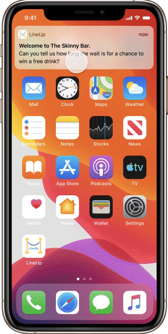
LineUp is an iOS app that utilizes crowdsourcing to display the current wait times for popular venues in New York City.
LineUp launched in 2019 and is currently used for nightlife venues, but has plans to expand in to other realms where lines are involved.
UX Design Process


Research
-
Screener Survey
-
User Interviews
Synthesize
-
Affinity Mapping
-
User Persona
-
Journey Map
-
Problem Statement
Ideate
-
Design Studio
-
MoSCoW Map
-
Mid-Fi Wireframes
-
Mid-Fi Usability Testing
Deliver
-
Hi-Fi Prototype
-
Hi-Fi Usability Testing
-
Specification Document
-
Style Guide
Research Methodology

Screener Survey
-
30 participants

User Interviews
Current LineUp Users
-
5 participants
Crowdsourcing Users
-
7 participants

Affinity Mapping
-
2 Affinity Maps
-
180 observations
-
7 insights
Shared key insights from both sets of user interviews, translated in to "I" statements:
-
I rely heavily on information provided by other users
-
I like when apps give me rewards for completing a task
-
I want my reviews to be helpful to others
-
I use crowdsourcing apps/sites to make travel decisions
-
I use social media to create and maintain connections
We began our research by testing two groups; current LineUp users and general users of crowdsourcing apps.
Objective:
-
Determine if the LineUp user is indeed the same as a general user of crowdsourcing apps
User Persona + Problem Statement
A user persona was created from the shared insights of the two sets of user interviews, and this persona not only represents the LineUp user, but it represents general crowdsourcing app users as well.
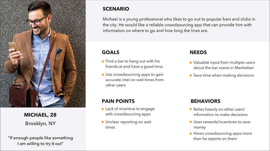
User Persona
Insight
People who want to go to bars in the city use crowdsourcing apps to help them find information on where to go and how long the lines are.
Problem
Michael uses the LineUp app to find bars and their wait times, but he is unclear about the wait time reporting system and has a lack of incentive to engage with it.
Opportunity
How might we encourage him to report on LineUp and give him clarity on wait time reporting while helping him to achieve his goals?
Journey Map
In order to focus on design opportunities, we plotted our user's emotional journey while heading for a night out in New York City.
UX Design Opportunity
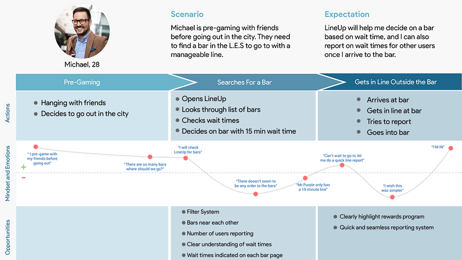
Journey Map
Design Opportunities
Although we had gathered a significant amount of data, we wanted to ensure that our ideas were aligned with the current LineUp users, so we revisited our interviews to look at specific opportunities within the current LineUp app.
Map Screen
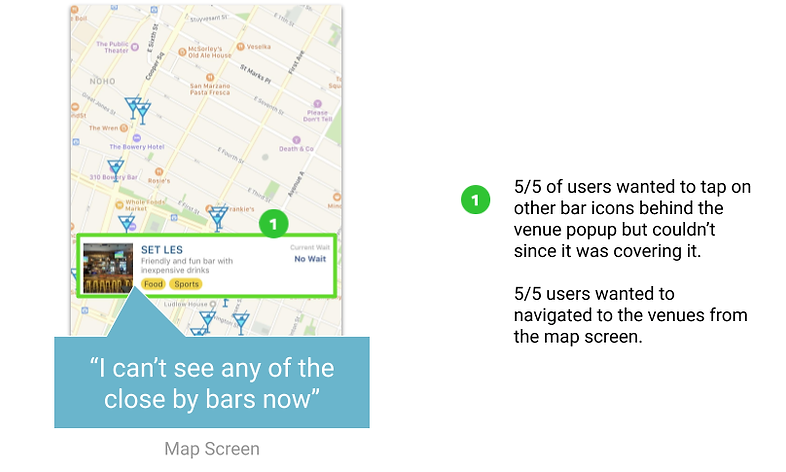
5/5 users wanted to tap on other bar icons behind the venue popup but couldn't since it was covered.
5/5 users wanted to navigate to the venues from the map screen.
News Feed Screen

5/5 users did not feel that they would interact with the News Feed
Home Screen

3/4 users did not know what the 'plus" button meant.
3/5 users felt the map icon was lost.
5/5 users liked the bar 'tags' however they thought that they would be able to search via these tags.
Reporting Wait Time

3/5 users were unsure of how to report as they were confused by what 'wait time' meant. Users also reported that the field was too small.
Rewards Program
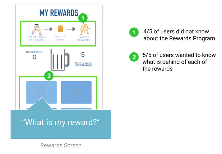
4/5 users did not know about the Rewards Program
5/5 users wanted to know what is behind each of the locked rewards
Feature Prioritization
Should Have
-
Social Element
-
Venue Events
-
Onboarding for Rewards
Must Have
-
Filter
-
Multiple Venue Photos
-
Favorites
-
Venue Reviews
-
Push Notifications
-
CV/Resume Upload
-
Private Commenting
Could Have
-
Comments
-
Show How Busy Venue is Inside
Won't Have
-
Google Map API
-
Feature locations besides bars
We then created a MoSCoW Map to guide us with feature prioritization in the first redesign iteration. All features listed are needed by the user and are to be implemented at some point, but in interest of time it was critical that some features were prioritized over others.
Design Methodology
Design opportunities distilled from research + synthesis
-
Change wait time reporting system
-
Create an engaging and simplified Rewards Program
-
Redesign the venue and maps to fit standard search/filter app conventions

Design Ideation
-
Home Screen
-
Rewards
-
Map
-
Venue
-
Additional Features

Mid-Fidelity Prototype
Usability Testing

Hi-Fidelity Prototype
Usability Testing
Mid-Fidelty Wireframes
Home Screen
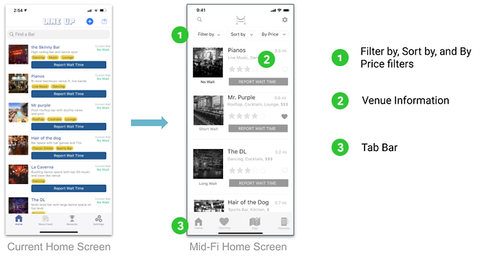.png)
Filter by, Sort by, and By Price filters
Venue Information
Tab Bar
Report Wait Time
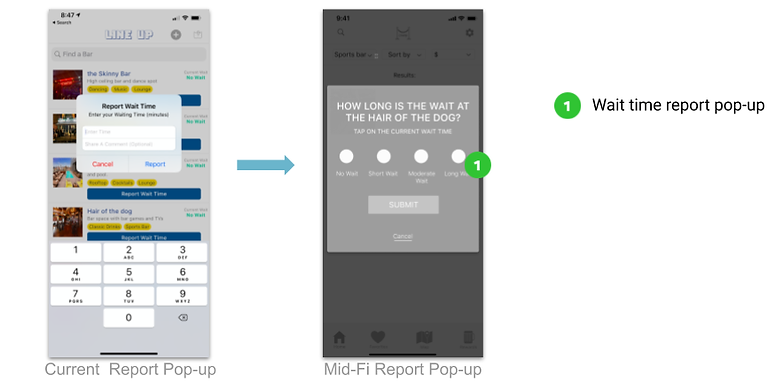.png)
Report Wait Time Pop-Up
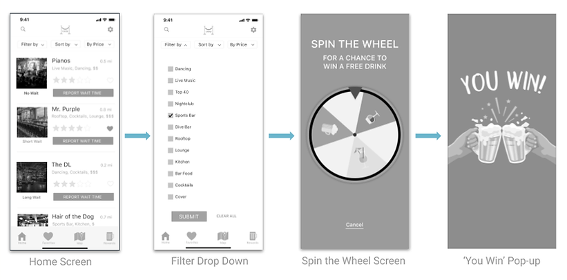
Rewards Program
.png)
Spin-wheel
Rewards Program Information
"Next Drink" icon and explanation
Venue Map
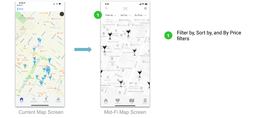.png)
Filter by, sort by, and by price filters
Mid-Fidelity Usability Testing
Usability testing was conducted on the mid-fi prototype to test for functionality of key features.
Report Wait Task 1
Use LineUp to find a sports bar.
Report Wait Task 2
Report that there is no one in line.
Task Flow
.png)
Task 1
5/5 users were able to find a sports bar
Task 2
5/5 users were able to report on a wait time
Hi-Fidelity Delivery
Design Improvements
Based on user data from the mid-fidelity usability tests, several design improvements were implemented in to the high-fidelity iteration.
.png)
.png)
Filter and Icons - Accessibility
Rewards Reminder Pop-Up
Button Size - Accessibility
Home Screen
Venue Map
.png)
The redesigned map screen now includes a Status Meter under the martini glass venue icon that indicates length of line. This will ensure accessibility for colorblindness.
Line Wait - Accessibility
My Rewards
.png)
The My Rewards information is no longer a repetitive image, but it is now a pop-up hidden behind an icon.
A "reward wallet" has been added for users to view their collected rewards.
My Rewards Information Pop-Up
Next Reward information
Reward Wallet
Mid-Fi Rewards Screen
Reporting Wait Time
.png)
During user testing we uncovered that using the term "Wait Time" was confusing and so we changed the wording to "Line Length" so that users could identify a more concrete concept.
Wait Time vs Line Length
Mid-Fi Report Wait
Pop-Up
Hi-Fi Report Wait
Pop-Up
Hi-Fidelity Prototype
Hi-Fi Prototype
Next Steps
Timeline
<30 Days
-
Implement hi-fidelity design changes in to existing product
30 Days - 3 Months
-
Conduct usability testing with LineUp users on updated product
6+ Months
-
Review analytics for user engagement metrics on updated product
Future Growth
-
Utilize UX research data to implement additional venue types outside of nightlife